Difference between revisions of "Chart2/DataLabels"
From Apache OpenOffice Wiki
< Chart2
m (→IMPORTANT: Outliers: Improve content) |
B michaelsen (Talk | contribs) |
||
| (4 intermediate revisions by 2 users not shown) | |||
| Line 8: | Line 8: | ||
* Of the labels to ease the readability. | * Of the labels to ease the readability. | ||
* covered in http://www.openoffice.org/issues/show_bug.cgi?id=64700 | * covered in http://www.openoffice.org/issues/show_bug.cgi?id=64700 | ||
| − | |||
| − | |||
| − | |||
| − | |||
| − | |||
| − | |||
| − | |||
| − | |||
| − | |||
| − | |||
| − | |||
| − | |||
| − | |||
| − | |||
== Free positioning of data labels == | == Free positioning of data labels == | ||
| Line 29: | Line 15: | ||
* If the automatism for data label positioning does not generate the desired result, it must be possible to adjust the position of each label manually. | * If the automatism for data label positioning does not generate the desired result, it must be possible to adjust the position of each label manually. | ||
* covered in http://www.openoffice.org/issues/show_bug.cgi?id=48170 | * covered in http://www.openoffice.org/issues/show_bug.cgi?id=48170 | ||
| − | |||
| − | |||
| − | |||
| − | |||
| − | |||
| − | |||
| − | |||
| − | |||
| − | |||
| − | |||
| − | |||
| − | |||
| − | |||
| − | |||
| − | |||
| − | |||
| − | |||
| − | |||
| − | |||
| − | |||
| − | |||
| − | |||
| Line 58: | Line 22: | ||
* covered in http://www.openoffice.org/issues/show_bug.cgi?id=27804 | * covered in http://www.openoffice.org/issues/show_bug.cgi?id=27804 | ||
| − | + | [[Category:Chart2]] | |
| − | + | ||
| − | + | ||
| − | + | ||
| − | + | ||
| − | + | ||
| − | + | ||
| − | + | ||
| − | + | ||
| − | + | ||
| − | + | ||
| − | + | ||
| − | + | ||
| − | + | ||
| − | + | ||
| − | + | ||
| − | + | ||
| − | + | ||
| − | + | ||
| − | + | ||
| − | + | ||
| − | + | ||
| − | + | ||
| − | + | ||
| − | + | ||
| − | + | ||
| − | + | ||
| − | + | ||
| − | + | ||
| − | + | ||
| − | + | ||
| − | + | ||
Latest revision as of 09:21, 25 November 2009
This list is based primarily on the List of wished enhancements for Charts.
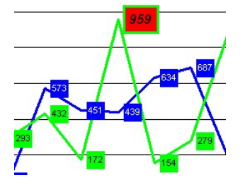
Add colors at the background and borderline
- Of the labels to ease the readability.
- covered in http://www.openoffice.org/issues/show_bug.cgi?id=64700
Free positioning of data labels
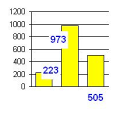
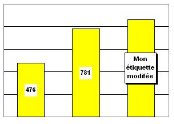
- If the automatism for data label positioning does not generate the desired result, it must be possible to adjust the position of each label manually.
- covered in http://www.openoffice.org/issues/show_bug.cgi?id=48170


