Difference between revisions of "Chart2/Axis"
(Added Outliers: Axis Break) |
(removed already implemented features from the list of missing features) |
||
| Line 11: | Line 11: | ||
* Y axis at the right | * Y axis at the right | ||
* covered in http://www.openoffice.org/issues/show_bug.cgi?id=55501 | * covered in http://www.openoffice.org/issues/show_bug.cgi?id=55501 | ||
| − | |||
| − | |||
| − | |||
| − | |||
| − | |||
| − | |||
| − | |||
| − | |||
| − | |||
| − | |||
| − | |||
== Affect units to the axis == | == Affect units to the axis == | ||
| Line 29: | Line 18: | ||
* This example displays units in Thousands. | * This example displays units in Thousands. | ||
* covered in http://www.openoffice.org/issues/show_bug.cgi?id=29918 | * covered in http://www.openoffice.org/issues/show_bug.cgi?id=29918 | ||
| − | |||
| − | |||
| − | |||
| − | |||
| − | |||
| − | |||
| Line 48: | Line 31: | ||
* In Excel 2000, it's not possible to modify text and label format individually. | * In Excel 2000, it's not possible to modify text and label format individually. | ||
* covered in http://www.openoffice.org/issues/show_bug.cgi?id=64703 | * covered in http://www.openoffice.org/issues/show_bug.cgi?id=64703 | ||
| − | |||
| − | |||
| − | |||
| − | |||
| Line 69: | Line 48: | ||
* covered in http://www.openoffice.org/issues/show_bug.cgi?id=64705 | * covered in http://www.openoffice.org/issues/show_bug.cgi?id=64705 | ||
| − | |||
| − | |||
| − | |||
| − | |||
| − | |||
| − | |||
| − | |||
| − | |||
| − | |||
| − | |||
| − | |||
== Outliers: Break Axis == | == Outliers: Break Axis == | ||
Revision as of 08:35, 31 July 2008
Contents
- 1 Limit the number of axis labels displayed
- 2 Inverse axis position
- 3 Affect units to the axis
- 4 Modify the scale of X axis also when it's not an XY chart
- 5 Axes labels customizable
- 6 Units of axes properties (numbers, hours, days, month
- 7 Ability to fix the maximum and minimum property of axes from a spreadsheet cell
- 8 Allow to change spacing between axes and axes labels
- 9 Outliers: Break Axis
Limit the number of axis labels displayed
- 1 over 2, 1 over 3,...
- Displaying the labels is automatic but it doesn't always meet the needs.
- covered in http://www.openoffice.org/issues/show_bug.cgi?id=58731
Inverse axis position
- X axis at the top
- Y axis at the right
- covered in http://www.openoffice.org/issues/show_bug.cgi?id=55501
Affect units to the axis
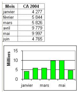
- Hundreds, Thousands, Millions,...
- Kilo, Mega,...
- This example displays units in Thousands.
- covered in http://www.openoffice.org/issues/show_bug.cgi?id=29918
Modify the scale of X axis also when it's not an XY chart
- In this example, scale begins on the 1/1 and ends the 3/1 while data begin the 2/1 and end on the 4/1.
Axes labels customizable
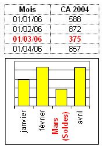
- One can choose the label text format and number format regardless the data source range.
- In this example, date format displayed differently from the data range. March label text is manually modified.
- In Excel 2000, it's not possible to modify text and label format individually.
- covered in http://www.openoffice.org/issues/show_bug.cgi?id=64703
Units of axes properties (numbers, hours, days, month
- The dialog that allows to modify axes properties doesn't indicates units (hours, days, weeks, month...) to adjust the scale (minimum, maximum, primary and secondary intervals)
an axes formatted to date and where the primary interval settings are less than 24 hours will be displayed as “double” format and not as hours.
- It's not possible to set a maximum date or a minimum date but only a number representing date in a numerical format.
- If axes are in date format, it's not possible to settle an interval every 1st of each month.
- covered in http://www.openoffice.org/issues/show_bug.cgi?id=25706
Ability to fix the maximum and minimum property of axes from a spreadsheet cell
Allow to change spacing between axes and axes labels
Outliers: Break Axis
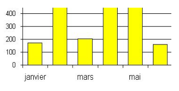
Occasionally one has to picture data that contains outliers. This is currently not easy performed. Consider the following data series: 1, 2, 3, ..., 9, 10, and 200.
Obviously '200' is far beyond the rest of the data. If we plot a bar-graph, the values 1-10 will be barely visible (and have almost the same magnitude), while the value 200 will strike out.
Workaround
To solve this issue, we need to be able to split the Y-Axis into 2 sections:
- first section could be from 0 to 20
- then it follows a short empty space (Y axis is discontinuous)
- and the 2nd Y-axis, which contains values around 200
e.g.
  Y-axis

    ^         ^
210 |         |
200 |         |
190 |         |
    /   OR   ...
    /         |
20  |         |
10  |         |
 0  |         |

a strike
 through   OR  ...
the Y-axis
This way it is possible to display accurately both the outliers (the 200 value) as well as the normal data, enhancing therefore the visualisation of all the relevant data.


