Difference between revisions of "Chart2/Axis"
From Apache OpenOffice Wiki
< Chart2
Tonygalmiche (Talk | contribs) |
(fixed issue 25706) |
||
| (6 intermediate revisions by 4 users not shown) | |||
| Line 3: | Line 3: | ||
* 1 over 2, 1 over 3,... | * 1 over 2, 1 over 3,... | ||
* Displaying the labels is automatic but it doesn't always meet the needs. | * Displaying the labels is automatic but it doesn't always meet the needs. | ||
| − | * covered in http://www.openoffice.org/issues/show_bug.cgi?id= | + | * covered in http://www.openoffice.org/issues/show_bug.cgi?id=58731 |
| − | |||
| − | |||
| − | |||
| − | |||
| − | |||
| − | |||
| − | |||
| − | |||
| − | |||
| − | |||
| − | |||
| − | |||
| − | |||
| − | |||
| − | |||
| Line 28: | Line 13: | ||
* Kilo, Mega,... | * Kilo, Mega,... | ||
* This example displays units in Thousands. | * This example displays units in Thousands. | ||
| − | * covered in http://www.openoffice.org/issues/show_bug.cgi?id= | + | * covered in http://www.openoffice.org/issues/show_bug.cgi?id=29918 |
| − | + | ||
| − | + | ||
| − | + | ||
| − | + | ||
| − | + | ||
| − | + | ||
| − | + | ||
| − | + | ||
| − | + | ||
| − | + | ||
| − | + | ||
| − | + | ||
| − | + | ||
== Axes labels customizable == | == Axes labels customizable == | ||
| Line 48: | Line 20: | ||
* In this example, date format displayed differently from the data range. March label text is manually modified. | * In this example, date format displayed differently from the data range. March label text is manually modified. | ||
* In Excel 2000, it's not possible to modify text and label format individually. | * In Excel 2000, it's not possible to modify text and label format individually. | ||
| − | * covered in http://www.openoffice.org/issues/show_bug.cgi?id= | + | * covered in http://www.openoffice.org/issues/show_bug.cgi?id=64703 |
| + | == Ability to fix the maximum and minimum property of axes from a spreadsheet cell == | ||
| + | * covered in http://www.openoffice.org/issues/show_bug.cgi?id=64704 | ||
| − | |||
| − | |||
| + | == Allow to change spacing between axes and axes labels == | ||
| + | * covered in http://www.openoffice.org/issues/show_bug.cgi?id=64705 | ||
| − | |||
| − | |||
| − | |||
| − | |||
| − | |||
| − | |||
| + | == Outliers: Break Axis == | ||
| − | + | Occasionally one has to picture data that contains '''outliers'''. This is currently not easy performed. Consider the following data series: ''1, 2, 3, ..., 9, 10,'' and ''200''. | |
| − | + | ||
| + | Obviously '200' is far beyond the rest of the data. If we plot a bar-graph, the values ''1-10'' will be barely visible (and have almost the same magnitude), while the value 200 will strike out. | ||
| − | + | '''Workaround''' | |
| − | + | ||
| − | + | ||
| − | + | To solve this issue, we need to be able to split the '''Y-Axis''' into 2 sections: | |
| − | * | + | * first section could be from 0 to 20 |
| − | * | + | * then it follows a short empty space (Y axis is discontinuous) |
| + | * and the 2nd Y-axis, which contains values around 200 | ||
| + | e.g. | ||
| + | '''Y-axis''' | ||
| + | |||
| + | ^ ^ | ||
| + | 210 | | | ||
| + | 200 | | | ||
| + | 190 | | | ||
| + | / ''OR'' ... | ||
| + | / | | ||
| + | 20 | | | ||
| + | 10 | | | ||
| + | 0 | | | ||
| + | |||
| + | a strike | ||
| + | through ''OR'' ... | ||
| + | the Y-axis | ||
| − | + | This way it is possible to display accurately both the outliers (the ''200'' value) as well as the normal data, enhancing therefore the visualisation of all the relevant data. | |
| − | + | [[Category:Chart2]] | |
| − | + | ||
| − | + | ||
| − | + | ||
Latest revision as of 15:16, 15 December 2010
Contents
Limit the number of axis labels displayed
- 1 over 2, 1 over 3,...
- Displaying the labels is automatic but it doesn't always meet the needs.
- covered in http://www.openoffice.org/issues/show_bug.cgi?id=58731
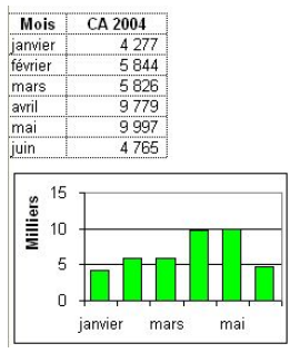
Affect units to the axis
- Hundreds, Thousands, Millions,...
- Kilo, Mega,...
- This example displays units in Thousands.
- covered in http://www.openoffice.org/issues/show_bug.cgi?id=29918
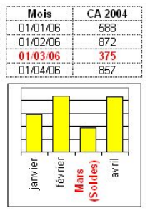
Axes labels customizable
- One can choose the label text format and number format regardless the data source range.
- In this example, date format displayed differently from the data range. March label text is manually modified.
- In Excel 2000, it's not possible to modify text and label format individually.
- covered in http://www.openoffice.org/issues/show_bug.cgi?id=64703
Ability to fix the maximum and minimum property of axes from a spreadsheet cell
Allow to change spacing between axes and axes labels
Outliers: Break Axis
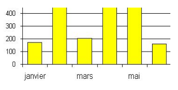
Occasionally one has to picture data that contains outliers. This is currently not easy performed. Consider the following data series: 1, 2, 3, ..., 9, 10, and 200.
Obviously '200' is far beyond the rest of the data. If we plot a bar-graph, the values 1-10 will be barely visible (and have almost the same magnitude), while the value 200 will strike out.
Workaround
To solve this issue, we need to be able to split the Y-Axis into 2 sections:
- first section could be from 0 to 20
- then it follows a short empty space (Y axis is discontinuous)
- and the 2nd Y-axis, which contains values around 200
e.g.
  Y-axis

    ^         ^
210 |         |
200 |         |
190 |         |
    /   OR   ...
    /         |
20  |         |
10  |         |
 0  |         |

a strike
 through   OR  ...
the Y-axis
This way it is possible to display accurately both the outliers (the 200 value) as well as the normal data, enhancing therefore the visualisation of all the relevant data.


