Visual Concept Proposals
| |||||||||||
These logos are not official, for a list of official logos visit here.
The artwork here is not (yet) meant for public representation. Even if it is licensed under an open source license, the name "OpenOffice.org" is trademarked.
Contents
Main Directive
The Art Project wants to provide a new basis for OpenOffice.org's visual branding. Therefore we start working on a new logo as well as on branding elements that can be used for OOo representation with and without the name "OpenOffice.org".
At the moment we want to create a set of logo proposals that can be presented to the community at the OpenOffice.org Conference in Orvieto. Because of the short time frame collection of logo proposals is limited until the 24th of October.
Follow these guidelines when submitting artwork please:
- License: Open source license, recommended: LGPL to be able to include it in the main program one day.
- Font: Open source font, recommended: liberation font familiy
- Color language: recommended: present icon colors and the "OOoBlue" from the present logo (RGB: 6,52,140)
- Graphical elements: recommended: Basic ideas kept from present branding bugs: Gull/gulls, "S"-curve from the icons.
- Additional information: Please comment your design giving a short reasoning of your idea and it's implementation.
Please keep your images in a medium sized box so that we don't have massive images stretching the page.
The image description box should contain
- a logo name we can refer to when we talk about it on the mailing list
- your name
- the license
You may copy an existing entry and replace the parts with your data.
Logo proposals
Jens Habermann
Description:
Letters of OOo presented in a different way.
OpenOffice.org text is just a placeholder, because this Logo should be used along an OpenOffice.org text
Works 3D/2D and can modified various ways
Description:
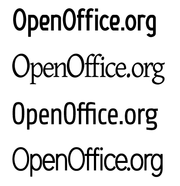
OpenOffice.org with new free fonts
Graham Lauder
I like the reversed "S" bug that's used in the icons. Going for simple, with text and the application colours in the reversed S type shape. Modern design is going toward finer text so I've gone away from bold text. Font is Liberation Sans at 130% height
Inkscape SVG source is [here]
This is one that I created back around the 3.0 launch, but this time I've done it in the 6:52:140 colour. Doesn't lend itself to Favicons/iconifying though, so I dumped it. That's what I thought at the time anyway but I've figured it out since. The text is probably too heavy for a modern logo. DejaVu Sans bold.
Inkscape SVG source is [here]
Yorick 05:04, 10 October 2009 (UTC)
This one was designed to be a little bit out there, but I stuck with the colours! :) The intertwined Os represent how OpenOffice.org is an inseparable combination of the software, Open Standards and OpenSource and the Community
Yorick 11:59, 10 October 2009 (UTC)
Your Name
Description:


