Difference between revisions of "Documentation/FAQ/Writer/AutomaticFunctions/The meaning of Single Spacing"
| Line 17: | Line 17: | ||
The last hint to understand the single line spacing on Writer is the following: If you insert the tallest character on your typeface in a line immediately after a line full of j (be sure the space before and after the paragraphs are set to zero) you will see that the top of the glyph will almost touch the bottom of the j. And now it is clear what single spacing means: a vertical space equal to the maximum font size for the given "point size". | The last hint to understand the single line spacing on Writer is the following: If you insert the tallest character on your typeface in a line immediately after a line full of j (be sure the space before and after the paragraphs are set to zero) you will see that the top of the glyph will almost touch the bottom of the j. And now it is clear what single spacing means: a vertical space equal to the maximum font size for the given "point size". | ||
| − | + | The 1.18 coefficient for Libertine font means that the tallest glyph is an 18% taller than the point measure says. | |
Clearly, "single spacing" is not a good choice if you use accented capitals like Á, Â or Ấ | Clearly, "single spacing" is not a good choice if you use accented capitals like Á, Â or Ấ | ||
| + | |||
[[File:Single-line.png]] | [[File:Single-line.png]] | ||
Revision as of 15:10, 13 June 2010
Most of the line spacing possibilities for paragraphs in Writer lie on top of the "single spacing" concept, which is not wrong by itself... The problem is that "single spacing" is not defined on the help: it only says "Applies single line spacing to the current paragraph. This is the default setting".
For Linux Libertine font (the same holds for Biolinum and Libertine C), and considering that a "point" (the standard unit used to measure fonts) is 1/72 of an inch, if you plot the line spacing as a function of font size (both measured on the same units), you will obtain a perfect linear regression with a 1.18 coefficient: that means "single spacing" for Linux Libertine (and Libertine C and Biolinum) is a distance 18 % larger than vertical font size.
For example: if you take a 12 points Libertine font, change that into centimetres (0.42333 cm) and multiply it by 1.18 you will get ~ 0.5 cm.
This "coefficient" could be slightly different for different typefaces (for example, for DejaVu Serif it is around 1.21 and for Liberation Serif around 1.19), but the relation line spacing/font size is always linear.
This linear relation between font size and line spacing is non-standard: usually small and large fonts needs larger line spacing than "mid sized" fonts.
But why this dependency on typefaces? you may ask. Because "font size" do not measure the real size for the font.
The usual font size (the font size you set on the character or paragraph style, or in the font size box in the Format toolbar) measure the distance from the bottom of the lowest glyphs (g, j, p, this is called descender) to the top of the tallest (l, b, h, this is called ascender) but do not consider diacritics or special glynphs. For example, an Ä go beyond the ascender for latin 1 characters so a 12 point font use more vertical space than 12 points: how much vertical space depend on the font design.
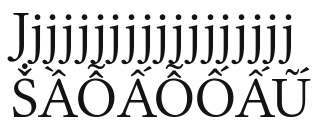
The last hint to understand the single line spacing on Writer is the following: If you insert the tallest character on your typeface in a line immediately after a line full of j (be sure the space before and after the paragraphs are set to zero) you will see that the top of the glyph will almost touch the bottom of the j. And now it is clear what single spacing means: a vertical space equal to the maximum font size for the given "point size".
The 1.18 coefficient for Libertine font means that the tallest glyph is an 18% taller than the point measure says. Clearly, "single spacing" is not a good choice if you use accented capitals like Á, Â or Ấ
