Difference between revisions of "Documentation/OOoAuthors User Manual/Impress Guide/Adding and Formatting Pictures"
(→Adding a new theme to the Gallery) |
(→Managing the Gallery themes) |
||
| Line 240: | Line 240: | ||
=Managing the Gallery themes= | =Managing the Gallery themes= | ||
| − | Graphics in the Gallery are grouped by themes, such as Bullets, Rulers, and 3D Effects. The box on the left of the gallery window lists the available themes. Click on a theme to see its graphics displayed in the Gallery window | + | Graphics in the Gallery are grouped by themes, such as Bullets, Rulers, and 3D Effects. The box on the left of the gallery window lists the available themes. Click on a theme to see its graphics displayed in the Gallery window. |
The default themes are locked; no items can be added or deleted from these themes. The locked themes are easily recognizable by right-clicking on them; the only available option in the pop-up menu is '''Properties'''. | The default themes are locked; no items can be added or deleted from these themes. The locked themes are easily recognizable by right-clicking on them; the only available option in the pop-up menu is '''Properties'''. | ||
| − | In a default installation, only the ''My themes'' theme is customizable, although new themes can be added as explained in | + | In a default installation, only the ''My themes'' theme is customizable, although new themes can be added as explained in [[#Adding a new theme to the Gallery]]. |
==Adding images to the Gallery== | ==Adding images to the Gallery== | ||
Revision as of 12:11, 1 August 2007
Template:NeedsWork This page was created by converting ODT to Mediawiki using Writer2MediaWiki.
This is Chapter 4 of OpenOffice.org 2.x Impress Guide (first edition), produced by the OOoAuthors group. A PDF of this chapter is available from the OOoAuthors Guides page at OpenOffice.org.
<< User Manuals page
<< Impress Guide Table of Contents
<< Chapter 3 Adding and Formatting Text |
Chapter 5 Creating Graphic Objects >>
Contents
Introduction
Pictures are often used in presentations as they can convey quickly a large amount of information. When wisely used, they can also give the presentation a professional look. Some presentations may require each slide to be marked with a company logo. You may also want to use Impress to create a presentation consisting only of pictures, such as a slideshow of holiday snapshots to share with friends.
This chapter describes how to insert and format pictures.
Inserting pictures
This section describes several ways to insert a picture from an external source into the presentation. Once the picture has been inserted, it can be formatted extensively as explained later in this chapter.
Inserting a picture from a file
Inserting a picture from a file is quick and easy. If the layout of the slide already contains a placeholder for a graphic, double-click anywhere in the graphics frame. This opens a dialog for selecting the file to be inserted. The detailed procedure is given below.

Slide with automatic layout including a placeholder for graphic object.
Whether you are using an AutoLayout for the placement of the picture, or you are just inserting a picture, follow these steps:
- Select Insert > Picture. (When using an AutoLayout; double-click in the graphics frame instead.)
- In the Insert Picture dialog, browse to the directory containing the desired picture.
- Select the file. OOo recognizes a very large number of image types.
- Click Open to place the picture on the current (selected) slide. The picture is now displayed on the slide with green resizing handles around it.

Inserting a picture from a file.
Notice in the Insert picture dialog the two checkboxes called Link and Preview. Their position is determined by the operating system, but they are normally in the bottom part of the dialog.
If Preview is checked, and if the selected file is in one of the many formats that OOo recognizes, a thumbnail of the selected image shows in the preview area on the right.
Select the Link checkbox to insert the picture as a link to the file rather than embedding the file itself. In general it is preferable to embed images so that the presentation can be copied to other computers, however on some occasions it makes sense to link the image rather than embed it:
- When the image file is quite large (linking rather than embedding will dramatically reduce the size of the presentation file)
- When the same image file is used in many presentations (for example when using the same background image for all the presentations created)
- When the linked file will be available when loading the presentation (for example if the presentation is a slide show of holiday pictures)
Inserting a picture from a scanner
Inserting an image from a scanner is normally fairly straightforward. Make sure that the scanner is supported by the SANE system if you are running the Linux (or other UNIX-like) operating system, or TWAIN if you are using a Windows version, and that it is already configured on the machine on which OOo is running. In case more than one scanner or equivalent device are present, select the source from Insert > Picture > Scan > Select Source.
To insert an image from the scanner:
- Prepare the image in the scanner and make sure that the scanner is ready.
- Select Insert > Picture > Scan > Request.
- The rest of the procedure depends on the scanner driver and interface. You will normally be required to specify the resolution, a scan window and other parameters. Consult the scanner's documentation for more information.
- When the image is ready, Impress places it in the slide. At this point it can be edited as any other image.
Inserting a picture from the Gallery
The Gallery contains a collection of images that you can use in a presentation. You can also add your own images to the Gallery, making it an essential tool for creating presentations quickly and with a consistent look. The Gallery is available in all components of OpenOffice.org. For an introduction to the Gallery, see Chapter 14 (Working with the Gallery) in the Getting Started guide.
Select Tools > Gallery or click the Gallery icon  on the Drawing toolbar.
By default, the Gallery is docked above the Impress workspace. To expand the Gallery, position the pointer over the line that divides it from the top of the workspace. When the pointer changes to parallel lines with arrows, click and drag downward. The workspace will resize in response.

The Gallery with the Hide/Show selector circled.
To expand the Gallery without affecting the Impress workspace, undock it so it floats over the workspace. To do so, hold down the Control key and double-click on the upper part of the Gallery next to the View icons. Double-click in the same area to dock it again (restore it to its position over the workspace).
When the Gallery is docked, to hide it and view the full Impress workspace, click the Hide/Show button in the middle of the thin bar separating the Gallery from the workspace. The Hide/Show button lets you keep the Gallery open for quick access while you create your slide show, yet out of the way when you need it to be. Additional information on the use of the Gallery can be found in Managing the Gallery themes.
Once you are satisfied with the Gallery display, select a theme from the left pane and then scroll as necessary through the right pane to find a suitable image. Click on the image and drag it onto the workspace.
Figure 4 shows an example of an image dragged from the Gallery.
inline:Frame1.png
At this point the image will be in your slide, but may not be of a satisfactory size; if necessary, re-size it as described in Resizing a picture.
Formatting pictures
This section discusses the formatting of pictures inserted with one of the methods explained in Inserting pictures.
Moving a picture
- Click the picture, if necessary, to show the green resizing handles.
- Move the pointer over the picture until the pointer changes shape. On most operating systems, the cursor associated with moving objects is a four headed arrow, but it may also be a hand or some other symbol.
- Click and drag the picture to the desired position.
- Release the mouse button.
For a more accurate placement of the picture, use the Position and Size dialog described in Chapter 6 (Formatting Graphic Objects).
Resizing a picture
- Click the picture, if necessary, to show the green resizing handles.
- Position the pointer over one of the green resizing handles. The pointer changes shape giving a graphical representation of the direction of the resizing.
- Click and drag to resize the picture.
- Release the mouse button when satisfied with the new size.
The corner handles resize both the width and the height of the graphic object simultaneously, while the other four handles only resize one dimension at a time.
Tip: To retain the original proportions of the graphic, Shift+click one of the corner handles, then drag. Be sure to release the mouse button before releasing the Shift key.
For more accurate resizing of the graphic object, use the Position and Size dialog described in Chapter 6 (Formatting Graphic Objects).
Caution: Be aware that re-sizing a bit-mapped (raster) image will adversely affect the resolution, causing some degree of blurring. It is better to externally size your picture before insertion into your presentation, if possible.
Rotating a picture
As for the position and the size, rotation of a picture can be done manually or using a dedicated dialog. The Rotation dialog is described in Chapter 6 (Formatting Graphic Objects). To rotate a picture manually, do as follows:
- Select the picture if necessary so that the green handles around it show.
- Click the Rotate button
 on the Drawing toolbar. This toolbar is usually located at the bottom the screen, but it can be undocked and used as a floating toolbar. If the toolbar is not showing, select View > Toolbars > Drawing. The Drawing toolbar is discussed in detail in Chapter 5 (Creating Graphic Objects).
- Eight red circular handles replace the green square handles. Move the mouse over one of the corner handles and the mouse cursor shape will change. Click the mouse and move in the direction in which you want to rotate the picture.
- When satisfied, release the mouse button.

Shape showing the red rotating handles. Only the corner ones are active.
Note: The icons representing the functions in the toolbars are different, depending on the operating system used and on whether OOo has been customized for the Linux distribution in use or not. When in doubt, hover the mouse over the icons and wait for the tooltip to appear showing the name of the button.
At step 2 a black crosshair with a circle appears in the middle of the picture: this represents the pivot point for the rotation. Normally the center of the picture will be just fine, but on some occasions you may wish to rotate around a corner or even around a point outside the picture; to do that, click on the crosshair and drag it to the desired position before applying the rotation, as shown in the figure above.
To restrict the rotation angles to multiples of 15 degrees, press the Shift key while rotating the graphic. This is very handy to rotate pictures of right angles, for example from portrait to landscape or vice versa.
Formatting using the Picture toolbar
When a picture is selected, the Picture toolbar becomes available. This toolbar provides a number of formatting options which are described in this section. If the picture toolbar does not show when an image is selected, display it by selecting View > Toolbars > Picture from the menu bar.
-

The Picture toolbar.
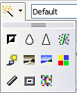
Applying filters
Use the left-most icon on the toolbar to apply various filters to the selected picture. The best way to judge if a filter works for your picture is to try it (step 4 of the following procedure explains how to undo). To apply a filter:
- Select the image so that the green handles around it show.
- Click on the magic wand icon
 in the Picture toolbar. The toolbar will expand to show the icons below.
- Select the filter to apply. To show the name of the filter, hover the mouse pointer over the icon and wait for the tooltip to appear.
-
The graphic filters available in Impress.

If not satisfied with the effect obtained, before doing anything else click the Undo button or select Edit > Undo: Bitmap Graphic Filter from the menu bar or press Control+Z.
Table 1 describes briefly each of the available graphic filters and their effects. See the Draw Guide for examples of the effects.
Table 1: Graphic filters and their effects
| Icon | Name | Effect | ||
| inline:graphics13.png | Invert | Inverts the color values of a color image, or the brightness values of a grayscale image. | ||
| inline:graphics14.png | Smooth | Softens the contrast of an image. | ||
| inline:graphics15.png | Sharpen | Increases the contrast of an image. | ||
| inline:graphics16.png | Remove noise | Removes single pixels from an image. | ||
| inline:graphics19.png | Solarization | Mimics the effects of too much light in a picture. A further dialog opens to adjust the parameters. | ||
| inline:graphics20.png | Aging | Simulates the effects of time on a picture. Can be applied several times. A further dialog will open to adjust the aging level. | ||
| inline:graphics21.png | Posterize | Makes a picture appear like a painting by reducing the number of colors used. | ||
| inline:graphics22.png | Pop Art | Modifies the picture dramatically. | ||
| inline:graphics24.png | Charcoal | Displays the image as a charcoal sketch. | ||
| inline:graphics25.png | Relief | A dialog is displayed to adjust the light source that on turn will create the shadow and hence the relief effect. | ||
| inline:graphics26.png | Mosaic | Joins groups of pixels into a single area of one color. |
Changing the Graphics mode
Use the next box in the Picture toolbar to change the mode of the image. Choose between:
- Default: no changes to the graphic object.
- Grayscale: the image is converted to scales of gray.
- Black/White: each pixel of the image is converted to black or white depending on the brightness value.
- Watermark: adjusts the brightness of the image making it suitable to be used as a watermark. For more information on creating watermarks, refer to Chapter 2.
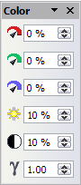
Adjusting the color
Clicking the color adjustment button  on the Picture toolbar opens the color adjustment dialog.
Use this dialog to modify the individual color components of the image (red, green, blue) as well as the brightness, contrast, and gamma of the image. If the result is not satisfactory, press Control+Z to restore the default values.
-
The color adjustment dialog.

Setting the object transparency
Modify the percentage value in the Transparency box  on the Picture toolbar to make the image more transparent. Note that this is different from the transparency settings for a line or a shape (described in Chapter 5).
Adjusting the line, area and shadow settings
These settings are not very commonly used for images, with the exception of the shadow setting that applies a shadow to the image.
Cropping pictures
To start cropping a picture, select the Crop icon  on the Picture toolbar.

The options available when cropping a picture.
The Crop dialog has the following options:
- Keep scale / Keep image size buttons: when Keep scale is selected (default), cropping the image does not alter the scale of the picture. When Keep image size is selected, cropping produce enlargement (for positive cropping values), shrinking (for negative cropping values), or distortion of the image so that the image size remains constant.
- Left, Right, Top, and Bottom: the function of these boxes changes according to the choice made between Keep scale and Keep image size. In both cases, when a value is entered in one of these boxes, the image is cropped by that amount. For example, a value of 3cm in the Left box will cut 3cm from the left side of the picture.
- When Keep scale is selected, the size of the image also changes, so in this example the width will be reduced by 3 cm. If Keep image size is selected instead, the remaining part of the image is enlarged (positive values for cropping) or shrunk (negative values for cropping) so that the width and height of the image remains unchanged.
- Note that the Width and Height fields change as you enter the values when in this mode. Use the thumbnail next to these fields to determine the correct amount by which to crop.
- Scale Width and Height: specify in percentages the scaling of the picture. The size of the image changes accordingly.
- Image size: specify the size of the image in your preferred unit of measurement. The image enlarges or shrinks accordingly.
- Original size: when clicked, restores the original image size.
Deleting a picture
- Click on the picture, if necessary, to show the green resizing handles.
- Press Delete.
Creating an image map
An image map defines areas of the image (called hotspots) with a URI (a web address or a file on the computer). Hotspots are the graphic equivalent of text hyperlinks. Clicking on a hotspot causes Impress to open the linked page in the appropriate program (for example, the default browser for an HTML page; OOo Writer for a .ODT file; a PDF viewer for a PDF file). You can create hotspots of various shapes, and include several hotspots in the same image.
To use the image map tool:
- Select the picture where the hotspots will be defined.
- Choose Edit > ImageMap from the menu bar. The ImageMap Editor dialog (Figure 10) opens.
- Use the tools and fields in the dialog to define the hotspots and links necessary.
- Click the Apply icon inline:graphics8.png to apply the settings.
- When done, click the Save icon inline:graphics9.png to save the imagemap to a file, then click the X in the upper right corner to close the dialog.
- inline:Frame26.png
The top part of the dialog contains the following tools:
- Apply button: click this button to apply the changes.
- Load, Save, and Select icons.
- Tools for drawing a hotspot shape: these tools work in exactly the same way as the corresponding tools in the Drawing toolbar (described in Chapter 5).
- Edit, Move, Insert, Delete Points: advanced editing tools to manipulate the shape of a polygon hotspot. Select the Edit Points tool to activate the other tools.
- Active icon: toggles the status of the hotspot activating a deactive the selected hotspot or deactivating it if active.
- Macro: associates a macro with the hotspot instead of just associating an hyperlink.
- Properties: sets the hyperlink properties and adds the Name attribute to the hyperlink.
Below the toolbar, specify for the selected hotspot:
- Address: the address pointed by the hyperlink. You can also point to an anchor in a document such as a specific slide number; to do this, write the address in this format: file:///<path>/document_name#anchor_name
- Text: enter the text that will be displayed when the mouse is moved over the hotspot.
- Frame: where the target of the hyperlink will open: pick among _blank (opens in a new browser window), _self (opens in the active browser window), _top or _parent.
Tip The value _self for the target frame will work just fine in the vast majority of the occasions. It is therefore not recommended to use the other values unless absolutely necessary.
The main part of the dialog shows the image on which the hotspots will be defined and the hotspot itself. Note that an active hotspot is indicated by a white shading, while an inactive hotspot is identified by a red border but no shading.
Managing the Gallery themes
Graphics in the Gallery are grouped by themes, such as Bullets, Rulers, and 3D Effects. The box on the left of the gallery window lists the available themes. Click on a theme to see its graphics displayed in the Gallery window.
The default themes are locked; no items can be added or deleted from these themes. The locked themes are easily recognizable by right-clicking on them; the only available option in the pop-up menu is Properties.
In a default installation, only the My themes theme is customizable, although new themes can be added as explained in #Adding a new theme to the Gallery.
Adding images to the Gallery
You can add new images to existing themes which you created or that can be edited. There are two ways to add an image to an existing theme.
Method 1 (selecting a file):
- Right-click on the theme name in the list of themes and choose Properties from the pop-up menu.
- Click the Files tab, if necessary.
- Click Add.
- Select a file and click Open. The image is added to the theme.
Method 2 (drag and drop):
- Open the document containing an image you want to add to the Gallery, and display the Gallery theme to which you want to add it.
- Position the mouse pointer above the image, without clicking.
- If the mouse pointer changes to a hand symbol, the image refers to a hyperlink. In this case, press the Alt key while you click the image, to select it without executing the respective link. If the mouse pointer does not change to a hand symbol, you can simply click the image to select it.
- Once the image is selected, evident from the green selection handles around it, release the mouse button. Click again on the image, keeping the mouse button pressed for more than two seconds. Without releasing the mouse button, drag the image into the document.
- Release the mouse button.
Deleting images from the Gallery
To delete an image from a theme:
- Right-click on the image in the Gallery window.
- Choose Delete from the pop-up menu. A message appears, asking if you want to delete this object.
- Click Yes.
Note The image is deleted from the Gallery only. The original image file is not deleted.
All the images in a gallery are actually linked files. From time to time it is beneficial to update the gallery theme to make sure that all the files are still there. To do so, right-click n the theme where you added at least one file and then select Update from the pop-up menu.
Adding a new theme to the Gallery
- Click the New Theme button above the list of themes.
- Click the General tab and type a name for the new theme.
- Click the Files tab.
- Click Find Files. The Select Path dialog opens. Browse to the folder that contains the image files for the new theme and click OK.
- Back on the Files tab, either click on Add All to install all of the files in the selected folder, or use File Type and/or select one or more files from the displayed list, and click on Add to install a selection of files to the new theme.
- Click OK when finished.
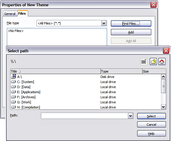
Setting up a new theme in the Gallery.

Note: The files do not show in the large box under the File Type box; and under the General tab, the Contents will display as "0 Objects," but the chosen files will be inserted into the new theme. Remember, you can always add or delete image files later.
| Content on this page is licensed under the Creative Common Attribution 3.0 license (CC-BY). |