Difference between revisions of "Proposal by Thibaut Dedreuil-monet"
| Line 99: | Line 99: | ||
{| class="prettytable" | {| class="prettytable" | ||
| − | | [[Image:Defaultanimation.png| | + | | [[Image:Defaultanimation.png|600px|thumb]] |
| − | + | ||
| − | |||
|} | |} | ||
| − | |||
== Mockup description == | == Mockup description == | ||
Revision as of 14:34, 19 May 2009
Time line frame
A great presentation is about delivering a message/information or even a news in a define period of Time by catching the attention of the public. This proposal is to add a time line frame in Impress.
Impress
As a multi-task application Impress can be used in a lot of different ways by different users. What will make Impress stand out of different application especially from draw Openoffice and its market competitor will be the easiness of its utilization.
Our users
Home users 67,43% Between 21 and 70 years old
Uses
Presentation of projects, Presentation of photos, Presentation of results, Presentation of data
Why a time frame?
As in a presentation time is the main problem to deliver your message it is important that a time frame is displayed even if you do not use the time process to change slide. By making this move we will definitely move away from the main market competitor and focus more on users needs.
Enhancement Audio will now be directly integrated to the presentation and the creation of photo presentation will be much easier
Mockup of the main design
Mockup description
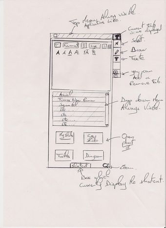
- The left side of the slide (part I): This part regroup the menu, the Drop down box and the bottom menu to open Part III
The top menu is a screenshot of the menu available actually in OpenOffice Impress on the bottom of your screen.
Why placed on top?
Because some users are now penalized by using a bottom menu. Effectively more and more people are using a dock (MacOSX, gnome-do, cairo-dock) which takes focus when you mouse over the bottom of your screen how annoying when half of the task you want to use are in conflict with your desktop.
It is not the actual representation i would like to see but this menu should focus on easy access to the main function, like Select, Insert, Display
The empty Box is the drop down box. No more little arrows next to a function if a menu is available to the selection the drop down box is displaying the selection.
Why ? it will allow user to discover new functions. Quicker display like for paste ...etc...
The third box is an easy access to (part III) By selecting a slide you will expand part III and this box will regroup quick access to auto slide,
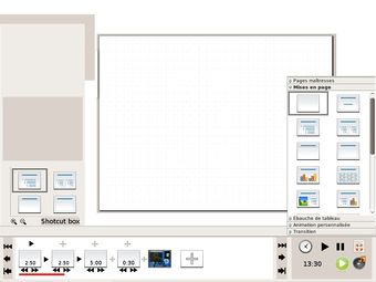
- The bottom side of the time frame (part II): Time line? I use only changing slide on click
This is the main focus of this proposal. Why would you need a time line in Impress? Even if you are not changing slide automatically, time is always the main problem for your presentation. We always have to check the time when you are preparing a presentation to give you an idea of how long it will take to present your work. [1]
So yes i am agree time is important but I'm only changing slide on click?
I think Impress by making a time frame will expand the use of this application allowing people to make presentation of their holiday photos weddings slideshow etc..
So how will it work? The clock is to select or not the time frame by selecting it buttons will appear on each/under slides to select the time.
If the user is moving for the first time the time display on the first slide it will affect as well the others slides and they will all have the same time. If the user is moving for the first time a random slide it will affect only this slide.
The Slides are size fixed only the time frame is moving depending on how long you want the slide display for. Maybe the time is directly display on each slide.
The red line is the actual audio frame which has been added which will expand/resize depending on the slide time display
On the bottom of the page there is the time frame which will expand/resize depending on the slide time display
If you have got a lots of slide the previous, next button will help you to navigate to the next 10 slide or the previous 10 slide.
The two others directly at the start/end of your presentation.
And of course play to have an idea of your presentation and pause to stop and work quicly your presentation.
To add a slide you just have to click on +
An empty arrow will be displayed to show that there is no transition between your slides if the arrow is black a transition has been selected.
Transition inside slide are displayed above the slide by clicking on it you will expand (part III ) and select transition of your text. Maybe an icon cross= no transition an icon play=transition to save you some space.
- And the left side of the slide (part III)
This is actually a copy of the actual left part of the default behaviour of Impress. But access is different You have to click on specific part to open the substantial part. See part II and I
mockup of the new design for animation in slides
Mockup description
This design was inspired by one of the greatest art in Renaissance: Music. In fact this proposal was based on music data sheet which can display at the same time length and tone. [2]
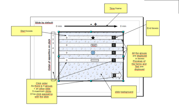
As you can see on the left mockup the default display is showing all the groups presents in your slide by long boxes.
Why all displayed?
Because if you want to create animation in your slide you do not want to certainly do only one group but all of them.
A thumbnail or a preview of the actual group should be display in each boxes to remove any confusion.
Two small boxes at the beginning and the end of each box define the apparition order on click. Everytime you change the click order by drag & drop a number on each case you will be able to select an animation on the right menu (see Previous mockups)
A time line is displayed above your slide by default time is zero but should be visible to user to show that you can change it.
Future
By focusing on this proposal we will expand the use of impress. And it will really improve the easiness to use this application.
- Alert during presentation.
One of the greatest innovation by making a time frame will be the possibility to add an alert during a presentation. When you prepared your slide you had chosen a time for each slide. As you go along during your presentation a non-intrusive alert could be display like removing pixels on a selected area allowing you to know exactly the time left for your presentation.
- Embedded videos
Will be directly display in the middle of the slides in the time frame.
- Drag&drop images
You could drag & drop images to each slides and photos presentation could be easier.
Problems of this Mockup
Space utilization!!
Author or Team Working on This Proposal
| Author / Team Member | Contact (OpenOffice.org login name, used for email) |
| Thibaut Dedreuil-Monet | taiebot |
Comments
| Community members, this is where your comments and questions concerning completeness and clarity should be written. Please add your OpenOffice.org login name to let us contact you via email. |
Your space :-)
Hello Thibaut Dedreuil-monet:
I was the same idea about timeline, but as I can't send my proposal on time, I'll try to enrich yours. Take this ideas if are useful for your proposal. My idea differs in that for transitions is more like Movie Maker with a contextual menu where I can select the animation, time, etc. About the space, well, I thought in some kind of inspector that has two tabs on top, actions and properties, they changed as you select some object or the presentation maybe have a lateral tabs representing the document hierarchy (Presentation, slide, object) where the user can modify actions and properties for objects that arent'n always accesible or visible. For slides I thought about something similar to the wall pane in Compiz, where you put your pointer on a corner and you have a thumbnail view of your slides or maybe as cooliris (the infinite 3d wall firefox plugin). In the slide panel, in the right and left should have a plus button to add a new slide after (or before) current and a spearhead (-> or <-) as another tool to go to the next (or prior) slide, if the current slide is the first, last or middle that buttons appear disabled or not.
The time line facilitate the sound inclusion, and the power that the user has at disposal and there should be the common buttons first, rewind, play/stop ,forward and end (|<- <<- -> ->> ->|) where to put them is a problem, I prefer in the bottom, but for space is better in one side.
The menu I confess that I don't have another idea than others showed here. About contextual menus, I thought in something cool but I don't know if is useful, instead the tradicional floating menu, it could be a some kind of roller where you can see 5 things (I describe them from top to bottom) a spearhead that when the user put the pointer roller up the cilinder or ball, next the next option that can be selected (but traslucent), next the current item, next the prior item and finally another spearhead as the first to roll down. Maybe the prior and next items should work as the first and last (the spearheads). This is less effort to select something, but has the disadvantage that I don`t see all in one view (or change the roll for a real ribbon and the same without the disadvantage).
About toolbar I take the idea from Delphi until V6 where you have in the left the very common basic tools (save, new slide, open a presentation, etc) and tabs for the rest of tooling grouped. Maybe the first tab should be by default with some useful tools, but that has the "intelligence" to change as the user use Impress and ordered based in a most recent used tool.
The most important idea is the time line as you did in your proposal, that's my two cents and good luck.
PD: Excuse for mi bad English and if you wanna or need more collaboration tell me please.
| I've worked on this part as well and i came up with quite the same idea as yours, i ve drawn some mockup as well about how animation should be integrated but i think they are going really too far for this project. I do not know how long it will take to redesign Impress but i m sure it should not break the code of all the software. So that's why i think this simple menu is the best idea to at least gain accessibility in order to create animations quicker. If there is any request i could post my drawings. ;-) |


